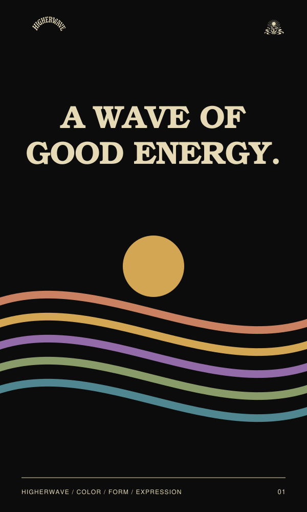
A wave of
good energy.
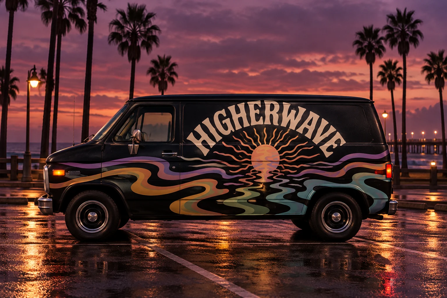
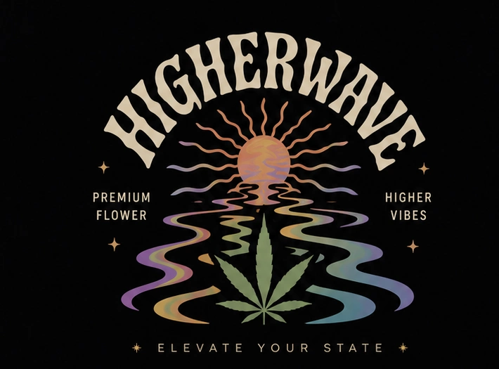
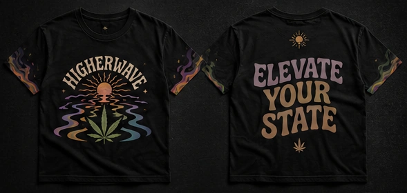
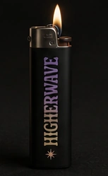
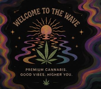
A conceptual visual identity for an adult cannabis brand, presented as a graphic-design study. Retro lettering, sunset tones and liquid color shape an expressive world across packaging and merchandise.
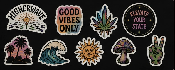
A rising sun meets a fluid horizon. Bold arched lettering, undulating lines and a tactile print vocabulary give every piece its own rhythm while keeping the identity recognizable.
VISUAL IDENTITY / PACKAGING / ILLUSTRATION / MERCHANDISE / MOTION
Let the identity
flow.
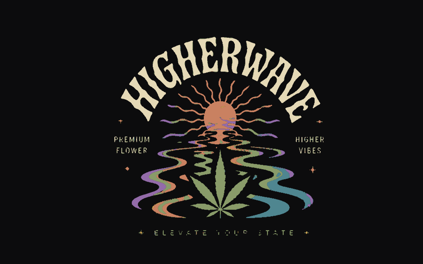
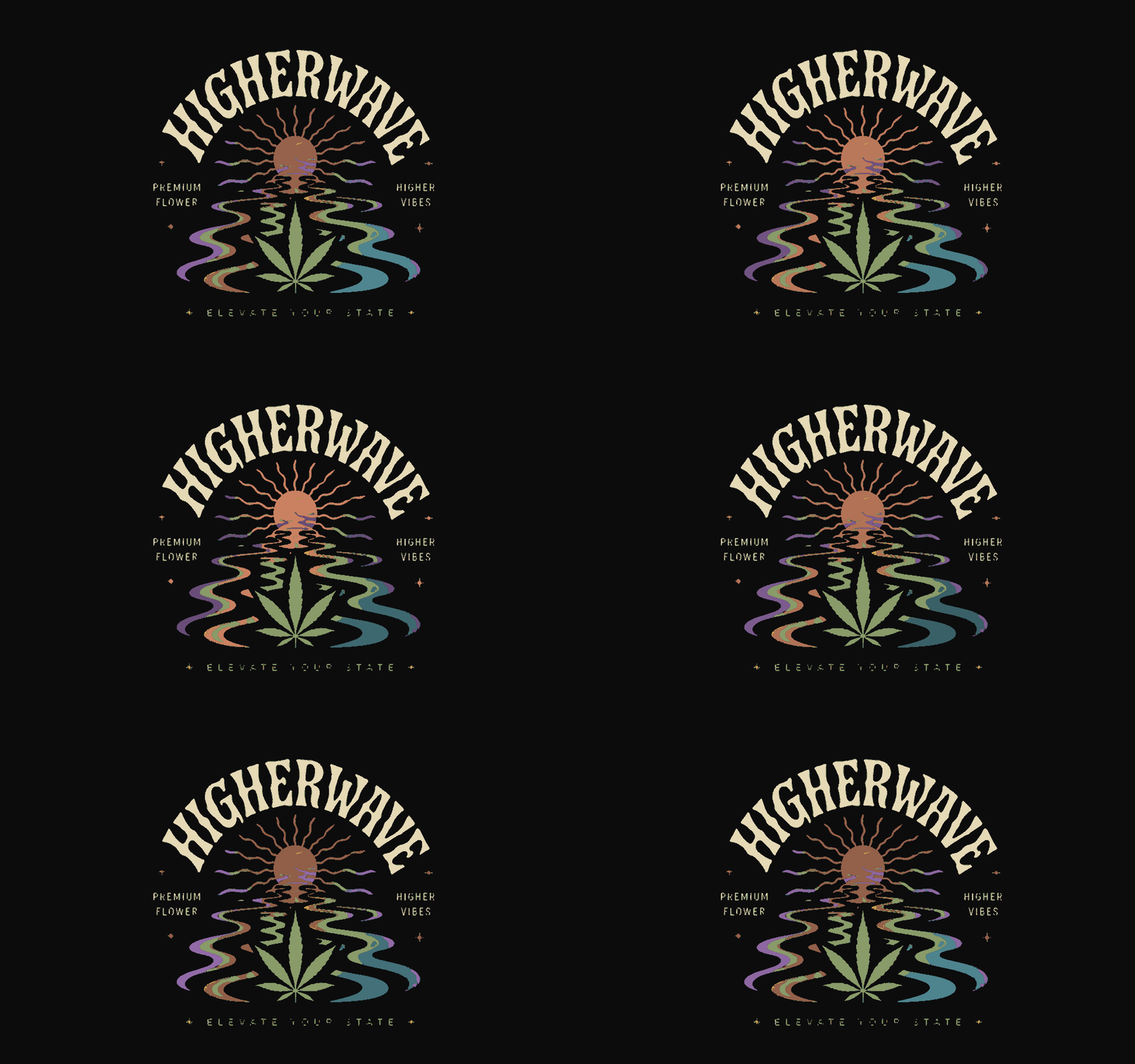
The original custom lettering and crest, outlined from the source artwork, with a subtle color rhythm.
Download high-res GIF ↓A sunset,
in seven colors.
Click a color to copy its HEX code.
Dark surfaces.
Liquid color.
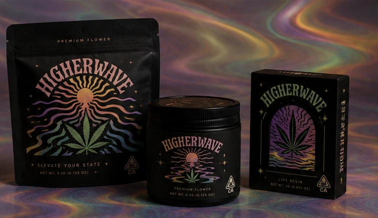
A consistent visual language, adapted to different formats and materials.
Independent graphic-design concept. Illustrative packaging and merchandise.
A whole world
of expression.
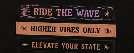
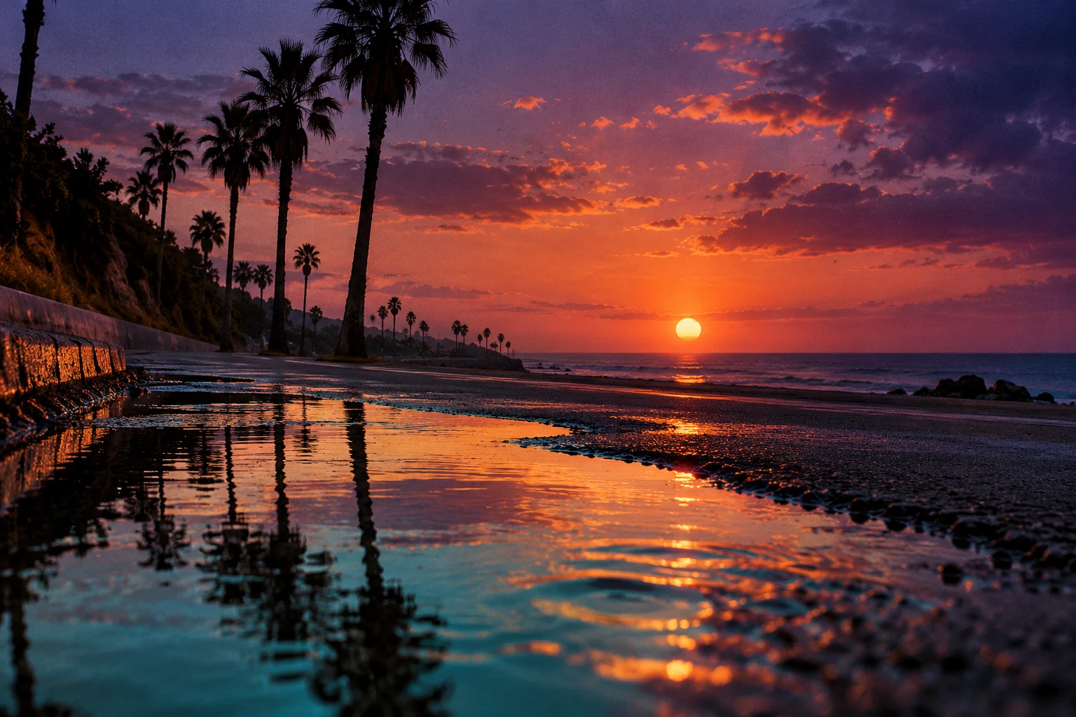
PHOTOGRAPHY / ART DIRECTION
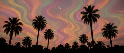
Where the color comes from.
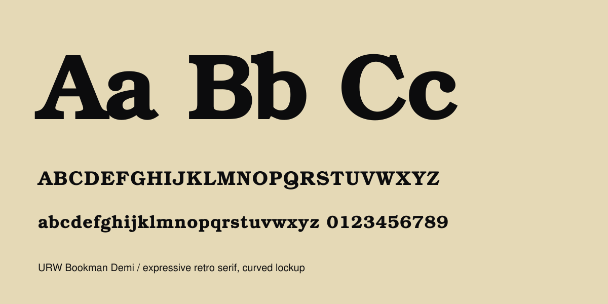
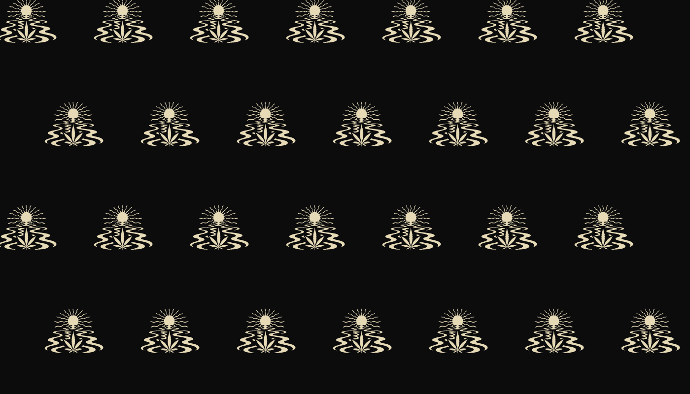
From a symbol
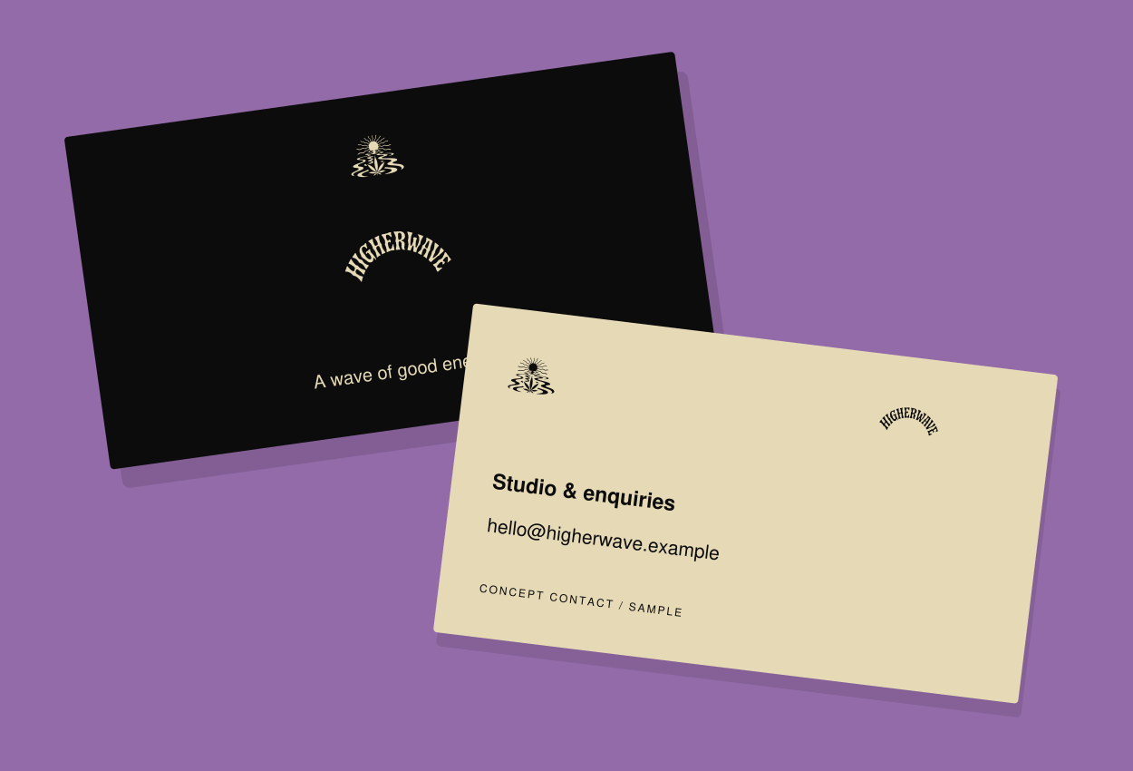
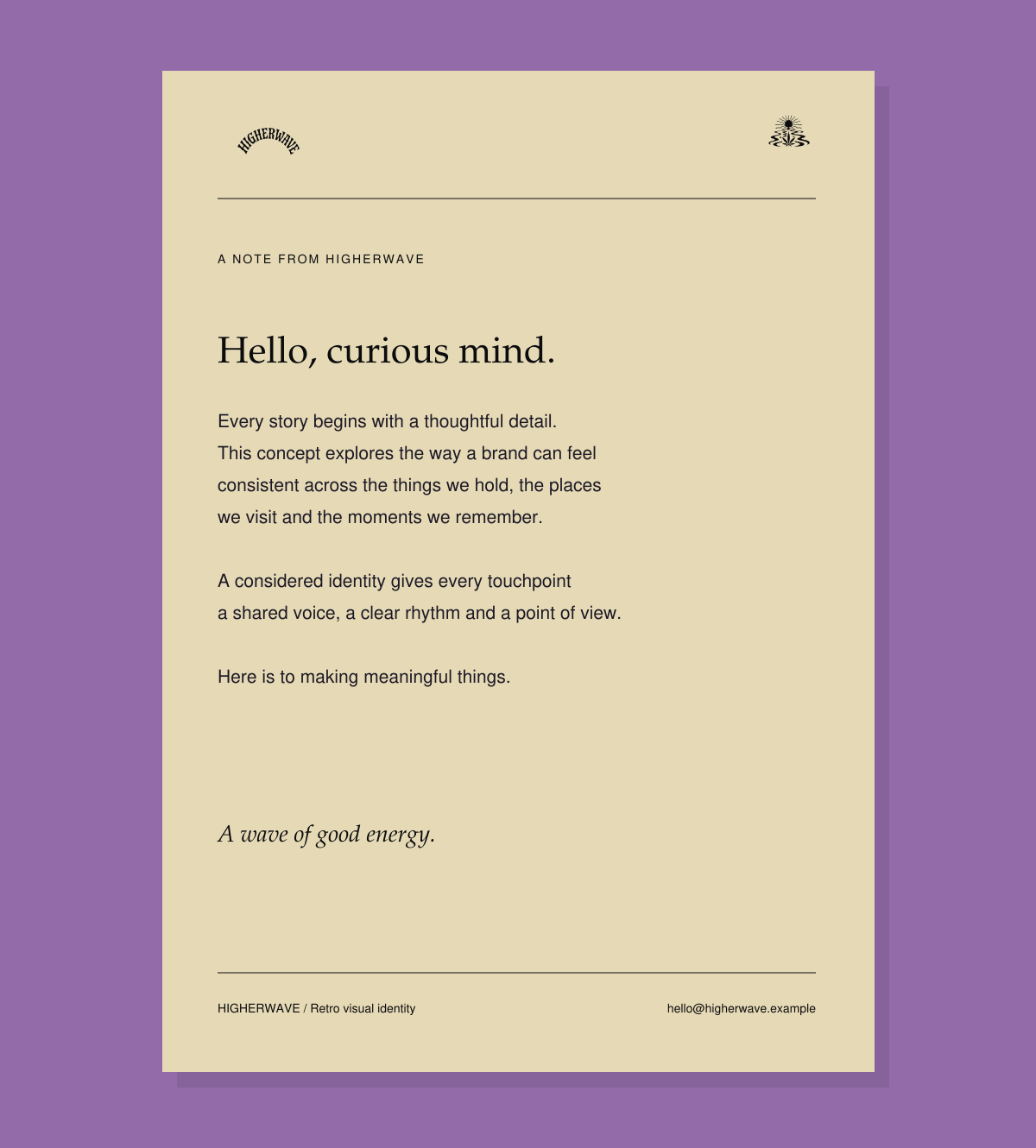
to a system.


Stationery, typography & vector applications +
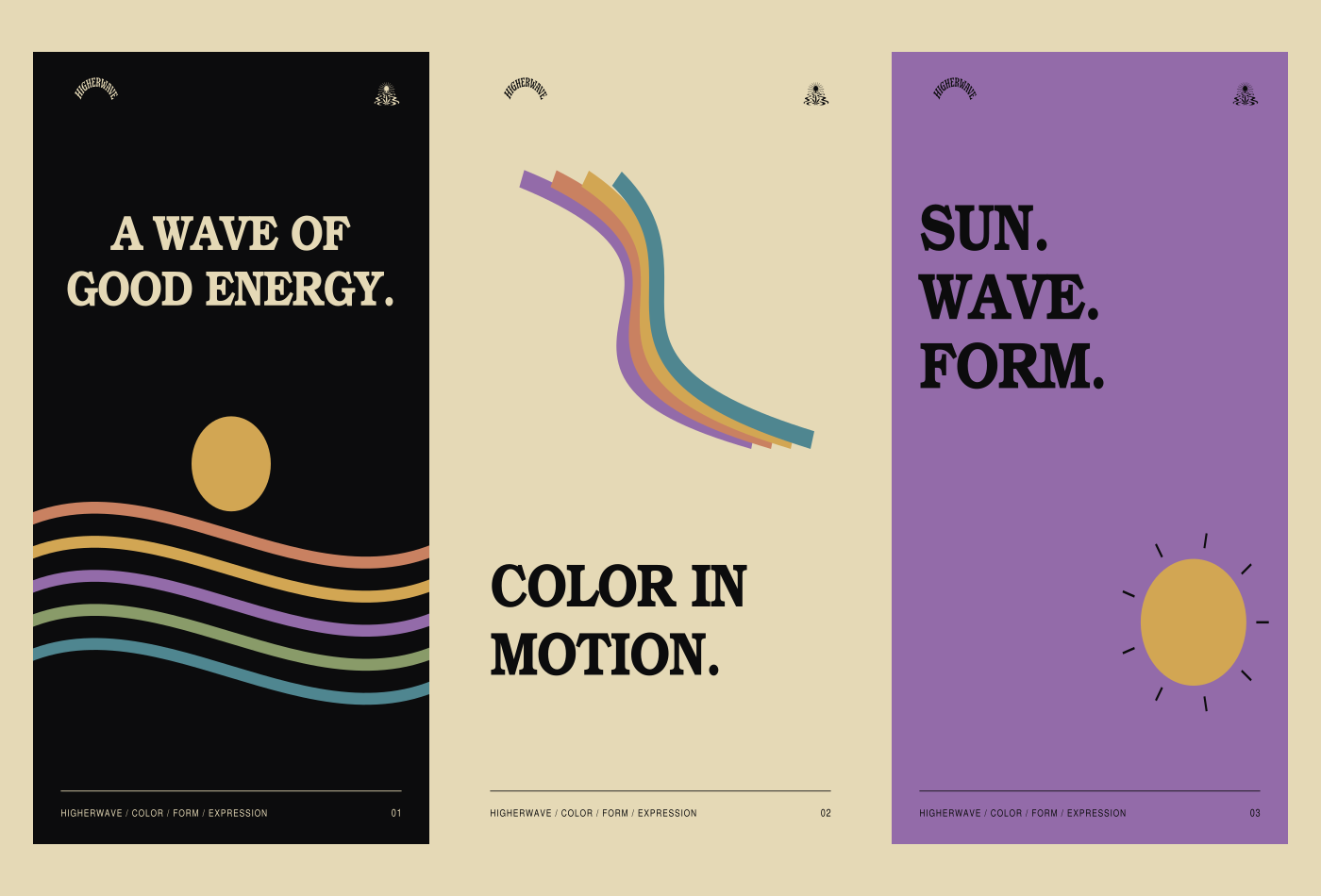
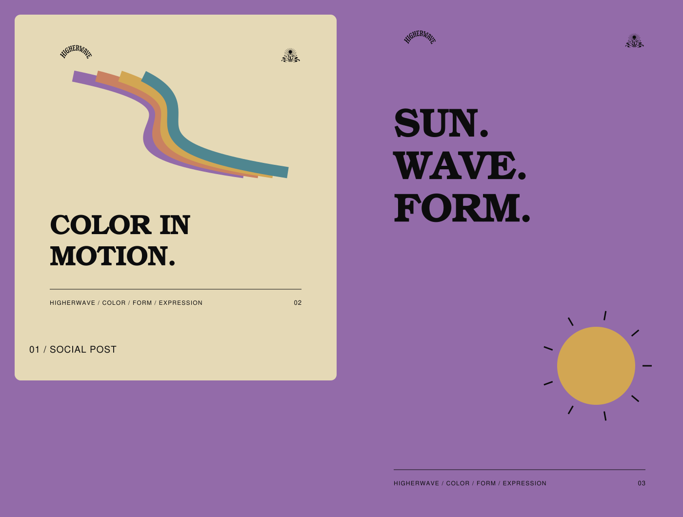
Color, in
different voices.
06 / DIGITAL ART DIRECTION
A living
visual world.
An interactive brand-world concept that translates the color, type and illustration system to the screen.
Explore the visual concept ↗
After the sun
goes down.